treasuredguardian
Contestant
   Gaming in the Dark Pit of Despair
Posts: 259
Pronouns: He/It/Void/Null/Pix/Vex/Byte/Blast/.EXE (see Bio for more neos)
Mini-Profile Background: {"image":"https://file.garden/ZWd7PdszsWLb2cuQ/Scenes%20to%20Redraw/PPT2%20Scenes/PPT2%20Episode%20Scenes/PPT2%2013%20Living%20on%20the%20Edge/vlcsnap-2023-10-17-12h17m53s995.png","color":""}
Mini-Profile Name Color: ffffff
Mini-Profile Text Color: ffffff
|
Post by treasuredguardian on Aug 18, 2024 16:38:03 GMT
You know, I just realized I haven't made an art thread for my other art. Let's change that! Left On a Bitter Note(PPT2)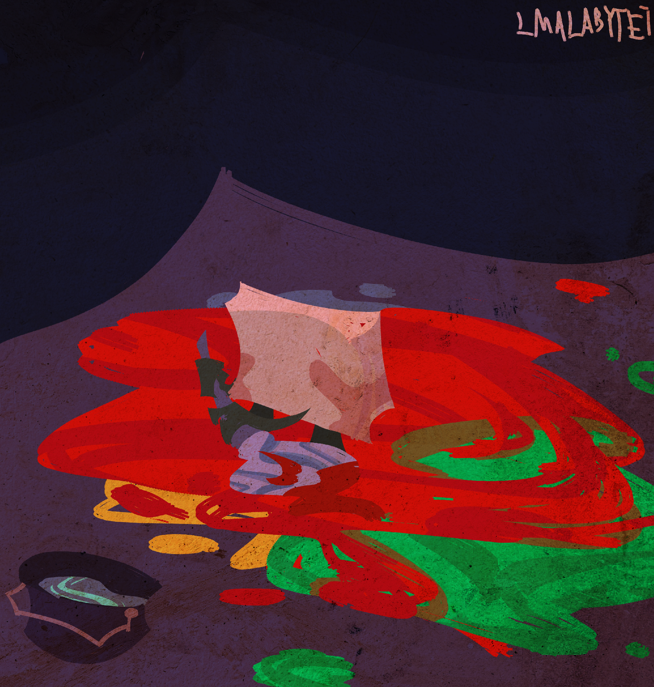 Commentary(CONTAINS SPOILERS FOR EPISODES 14 OF PPT2!!) Commentary(CONTAINS SPOILERS FOR EPISODES 14 OF PPT2!!):
As I watched Take 2 more and more, I began to notice that Post-It Note is not only very busy, but also very unlucky as well. He makes all of these efforts to help out the team, but more often than not it ends up being for vain due to events that are out of his hands. The only times where his contributions actually made a difference was in "Suboridinate Solvers" and that was because Gold Ingot wasn't there to stop Ace from using his powers. You could maybe say "Blue Nightmares", though I feel there it was more a "survival" move and less a "competition" one. Even with the amount of times his team has lost, Post-It Note still kept trying to help them out anyway.. It's no wonder he wanted a break when the H-? conflict blew over! Which is then denied because he declined Journal's offer to do more research.... And subsequently ran away...
Here, I wanted to convey this in the form of literally cleaning up everyone else's messes. Team 47's puddle is more prominent, seeing as they were a massive threat and the reason the H-? pact was made. Or really, just responsible for a lot of the stuff that happens in this show.
Another part of the inspiration actually came from listening to "Shell of a Fan"(from II2 13's soundtrack). Hence the pun based title. I speculated that Post-It Note would have a very emotional elimination. And it turns out... I was right! Okay, a lot of people saw it coming, but at least I was rewarded for noticing Post-It Note's plot up to this point. Yep, this was made before "Platinum Puppets" came out.
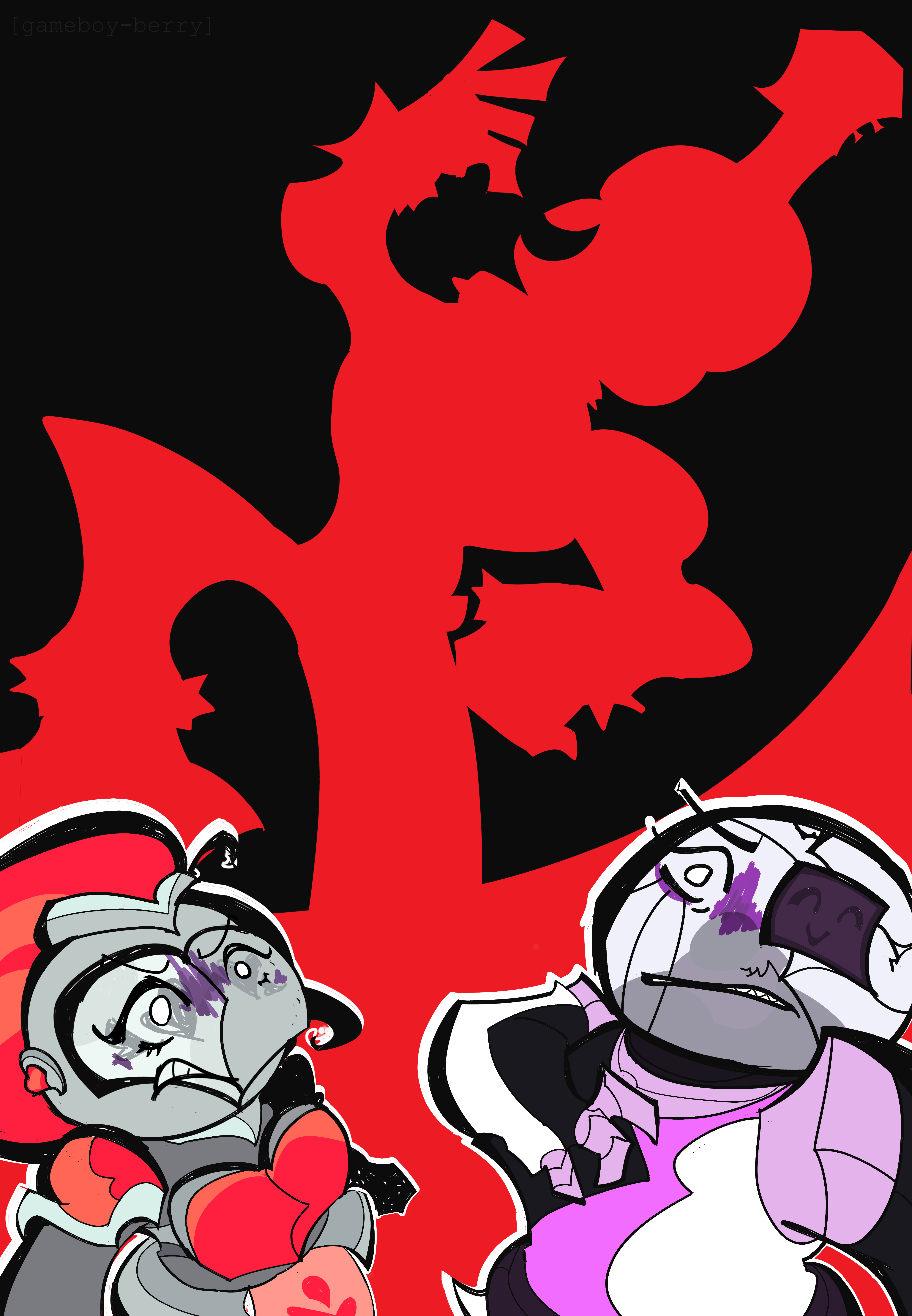
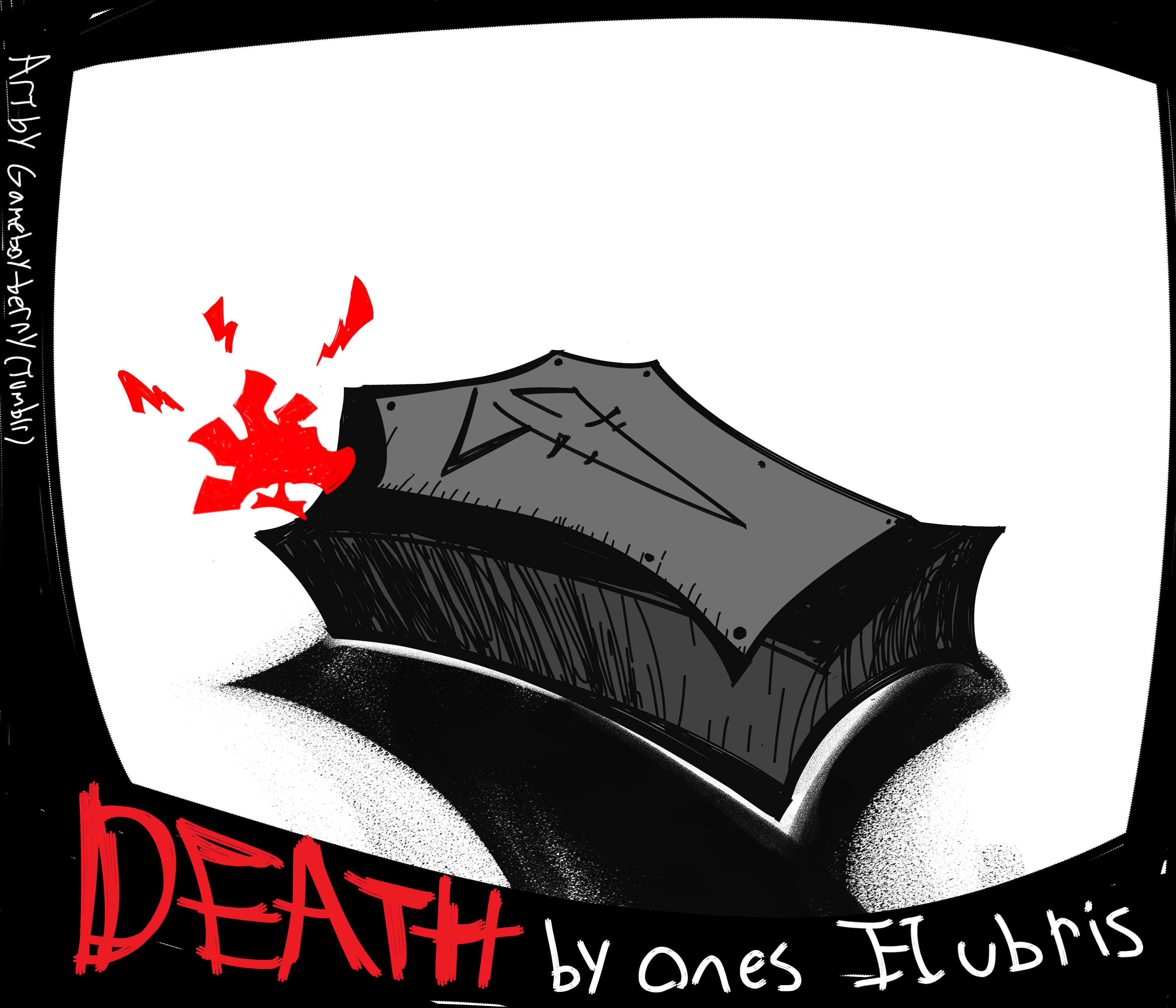
Overkill(Unusual Battle)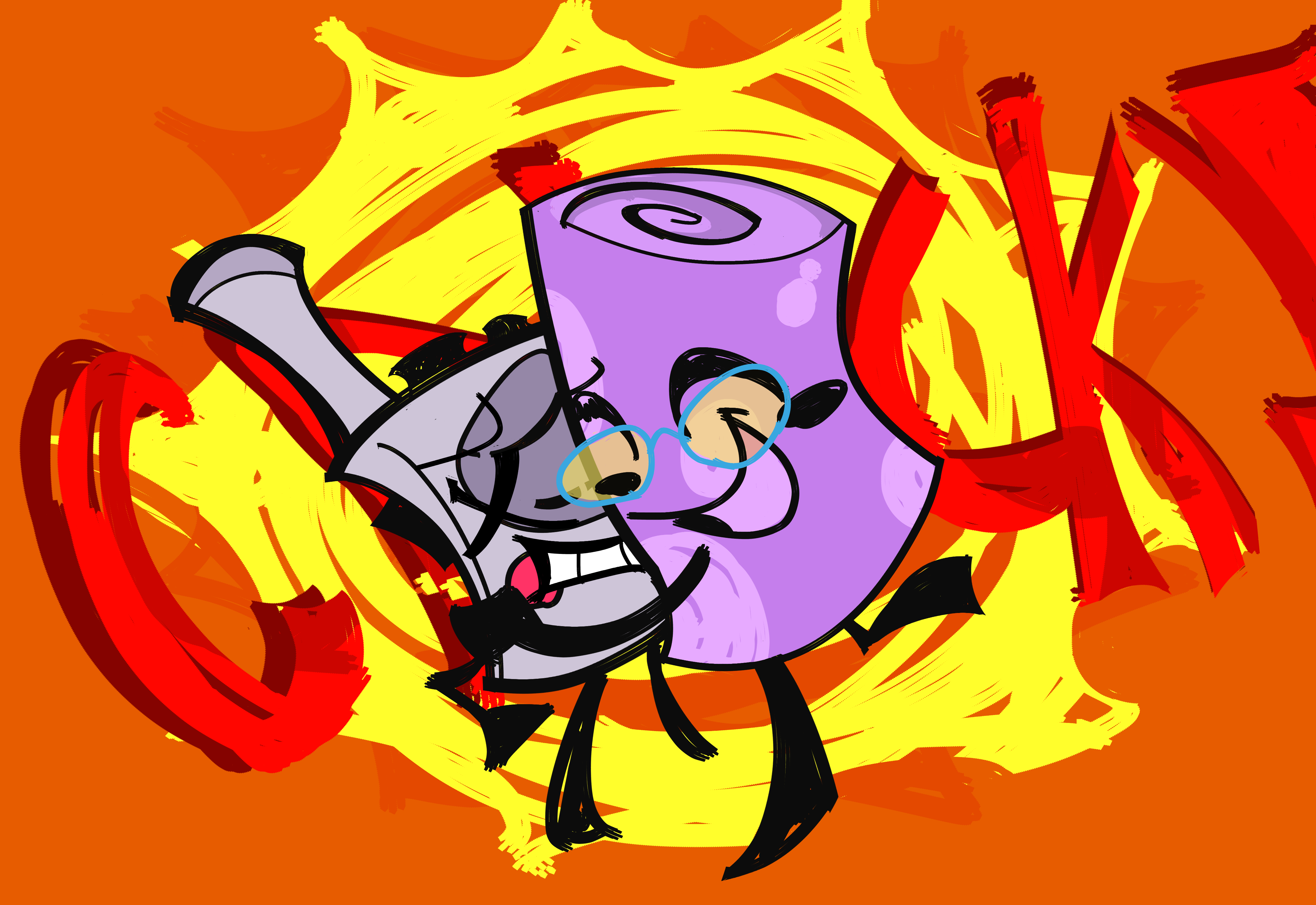 Commentary Commentary: Based on episode 5a of Unusual Battle. The tonal whiplash in that show was hilarious to me. On one hand, you have this story about a Company laced with backstabbings and outright murder. On the other hand, this mat kills a guy by hugging him too hard. I wouldn't be surprised if this plot point didn't carry over to Cast 139. Barking up the Wrong Tree(PPT2)The episode is nearly two months old as of this post, but I just wanted to make sure I don't spoil it for those who still haven't seen it yet. After all, it does indirectly spoil a certain plot point in later episodes. Commentary(SPOILERS FOR EPISODE 15 OF PPT2!!): My first big drawing for episode 15! I wanted to do a dramatization of the Axe sequence. The moment I saw the thumbnail, I KNEW I had to do it. This was a fun exercise in perspective. One of the hardest parts was actually getting the expressions right. I wanted to try something new with the way I draw eyes emoting with eyelashes in mind. I wanted to keep the simplicity of the dot eyes, but didn't want to clutter it with the lashes as well. Seeing as I draw both of these characters with very elaborate eyelashes, it took a few tries. Not only that, but Plasma Ball and Knight Helmet are also very expressive characters, so I wanted to give them justice. Originally, this was going to be a split image with Ukulele cutting the tree at the top and the Hs at the bottom... I felt the composition was a bit too disjointed, so I opted for something that would connect the two parts better. We Have Someone Upon Whom We Depend(PPT2)Commentary(GENERAL PPT2 SPOILERS! Especially for Episodes 12-14): I know, it's a PPT2 drawing with an II2 title... The lyrics also happened to fit the state of the game at the time... The song actually fits the show in general, which isn't too surprising anyway LOL. This is actually a redraw of a drawing I did when "Living on the Edge" first came out. Here, I wanted to try a different approach with the silouettes while still keeping it relatively simple. I took some liberties for Bottle, but that was because the nature of her design made it awkward to shade in a certain way. I wanted to keep a sense of consistency... But in retrospect maybe I was a bit too excessive? I also wanted to make sure the negative space made the drawings easier to read this time around. I had to change some poses to accommodate for this. As for Journal, I wanted to try out a new perspective to further contrast between him and the above contestants. It kind of fit given the background looked like a cartoon void from a worm's eye view. I still wanted to make the face symbolism apparent, so I didn't make the perspective too drastic. FUNNY FACT: In the previous version, I drew Journal holding a wrench-like tool because I figured he would probably be off finding tools during his time in LotE. It should be noted that Journal was completely absent in the episode, which was a first for the season. Naturally this was a really really big deal given that the whole narrative pre-merge was pretty much built around trying to progress his story (why else do you think Team 47 won so many times?). When he finally made another physical appearance in the next episode, guess what he was wielding? A crowbar!! So to keep the drawing up to date, I replaced the device with a crowbar. How did I come up with the idea for the wrench looking thing? I just winged it. Not all of my design choices, gijinka or otherwise, have any big reason to be there. I feel the composition of this drawing speaks for itself. That said, I have made an image breaking down my thought process with the previous version, and it also applies to this one. If you are curious, here's the link. Anyway... TREASURECHESTFTW. : This was made for Halloween I think???? I don't remember... All I know is that I wanted to draw something in a similar style to those old illustrated prints you see.
As always, there's a fair bit of symbolism to this. I feel this also speaks for itself... But this IS a commentary section so.. I'll explain it here anyway.
It's pretty straightforward, really. It's the final nail in the coffin for Treasure Chest and his team. I know it's a small detail and likely didn't mean much anyway, but I always found it fascinating that Treasure Chest's Battle Dungeon Ultra had him wield a shield with his team's name on it... Whereas Caramel Cube, another Team Captain, doesn't have her logo anywhere on her design... Treasure Chest is that dedicated to his role as team captain that his team that it might as well be a part of him. It does make sense given his assigned role as Paladin(which fits him too well, actually). The number of nails here isn't a coincidence; Each nail represents the amount of teammates prior to "Don't Press It!". I'm sure we all know what the one on his hand represents.
|
|
treasuredguardian
Contestant
   Gaming in the Dark Pit of Despair
Posts: 259
Pronouns: He/It/Void/Null/Pix/Vex/Byte/Blast/.EXE (see Bio for more neos)
Mini-Profile Background: {"image":"https://file.garden/ZWd7PdszsWLb2cuQ/Scenes%20to%20Redraw/PPT2%20Scenes/PPT2%20Episode%20Scenes/PPT2%2013%20Living%20on%20the%20Edge/vlcsnap-2023-10-17-12h17m53s995.png","color":""}
Mini-Profile Name Color: ffffff
Mini-Profile Text Color: ffffff
|
Post by treasuredguardian on Aug 18, 2024 17:57:21 GMT
The Flat Fucks(OM/C139/OBS)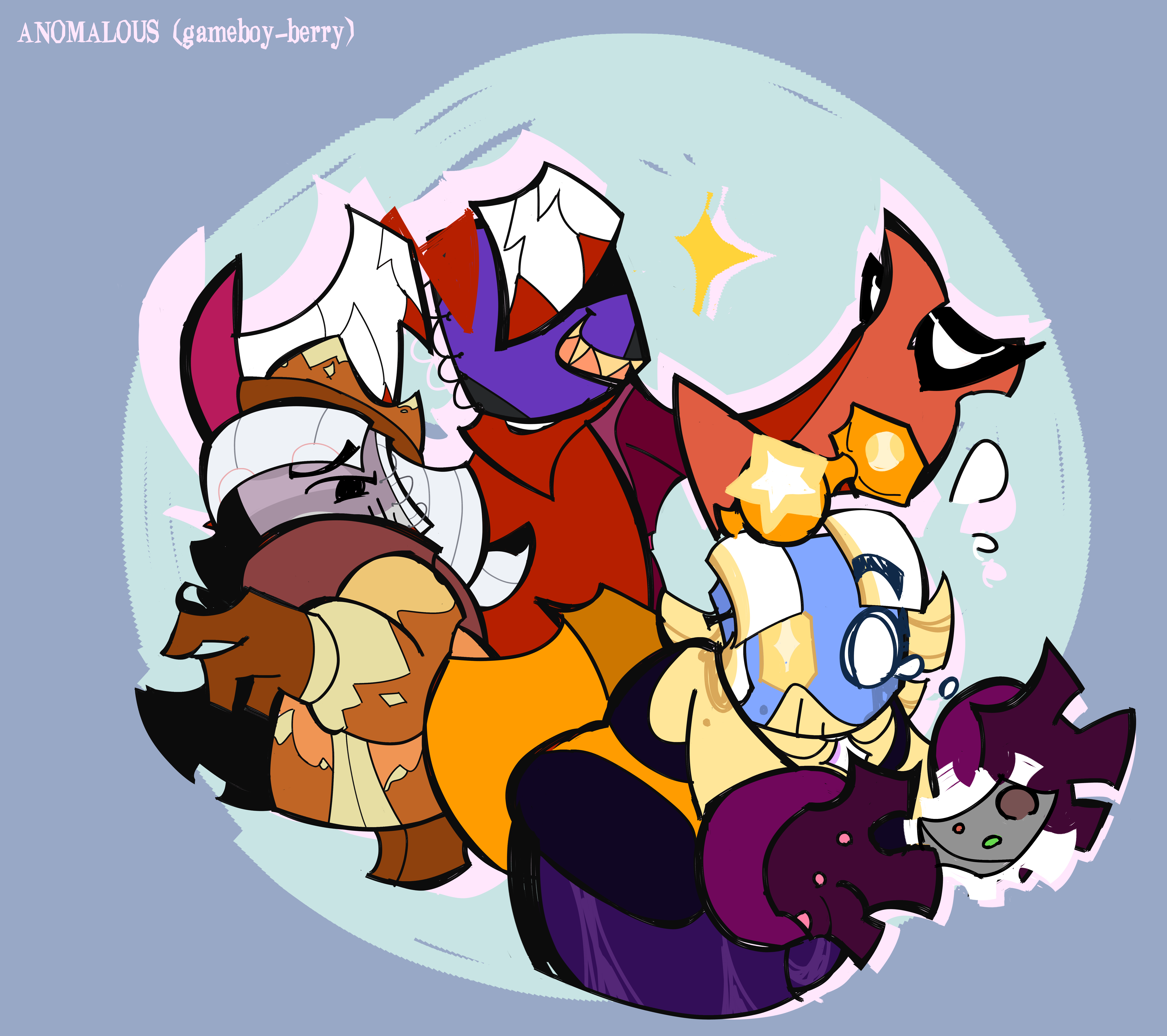 Commentary Commentary: Just gijinka versions of three notebook characters from smaller, more obscure shows... Okay, I suppose people know a fair bit about OBS... But the Notebook there is a relatively unpopular character so it checks out. You know, Object Mayhem used to be one of the bigger shows back in 2014. It was even on a poster alongside other object shows, which is used on the TV Tropes Page of the genre. The creator hasn't been active in forever, so I get why it feel in obscurity as the community grew bigger. You know, I was going to do a counterpart with the casebounds but... I didn't have designs for all of the ones I had in mind... AND I wanted to stick to a more specific type. This only makes me realize how damn common spiral notebooks are in these shows. Given that object show characters often tend to be based on items from the creator's real life, it makes sense. You have probably noticed that these characters wear distict outfits from each other. This is based on a rule of mine that if there's an object type that is commonly associated with a specific archetype, I have to give unique outfits for each of them. I have a set of rules in mind for object show gijinkas, some of which help me push to be more creative. That said, the spiral bounds have given me a much easier time than the casebounds. This is because whereas the casebounds are based on a more specific type of book(usually based in knowledge), the spiralbounds tend to be much more generic, having some more variety in archetypes as a result. That and I couldn't really see these 3 wearing the typical bookworm outfit. Object Mayhem's Notebook is clever, but he comes across more as a media geek than someone like Paper Puppets' Journal or BFDI's Book. Cast 139's Notebook is based on a variation of the smart archetype, but as he's shown to make devices, I felt making him look like a tinkerer was more fitting. I gave Obsolete Battle Show's Notebook colder clothing partially because it fit in the sense that he's cold and thinks he's above everyone else. That and their voice gave the impression of an old Saturday Morning cartoon bully talking through a scarf. FYI: C139's Notebook is supposed to be tripping here. Just in case anyone's confused. Speaking of which... Notebook gijinka concept(the C139 one)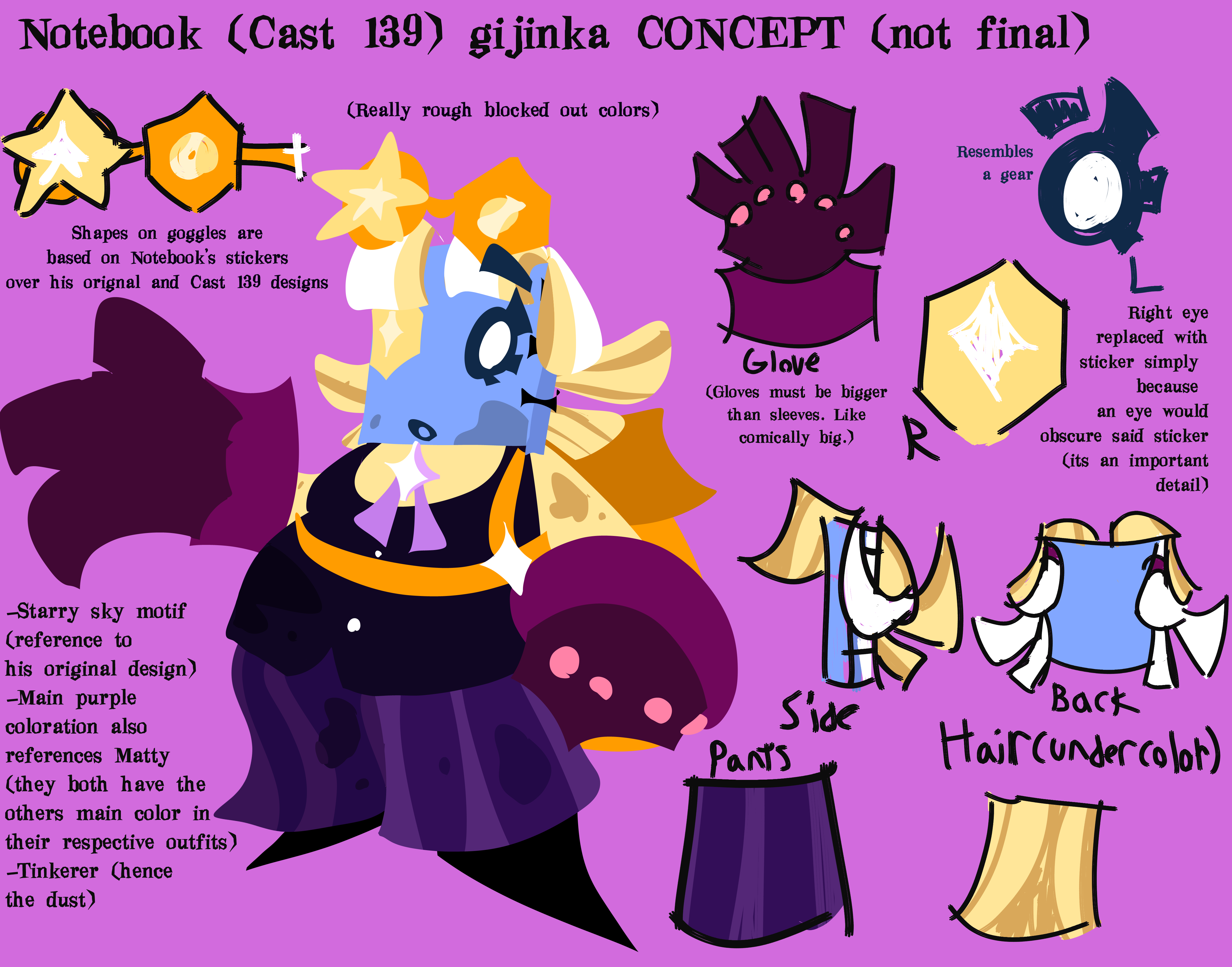 Commentary Commentary: I tend to do the books first. This is due to bias, but also because they can either be very easy to design, or really freaking difficult. This applied to the former. One of the main reasons why I actually started doing object heads over humans(or really, humans with object attributes) was because of the stuff I mentioned above, LOL. There's a fair bit of commentary in the image itself, so here I'll go over the process: -I draw object show characters with relatively large eyes. As Notebook's sticker... Badge? Thing is an important distinguishing feature, I opted to have it cover where his right eye would be instead. -Another one of the rules I have for these gijinkas is that I tend to base the body types of the gijinkas off the size and dimensions of their object(among other factors). For Books specifically, I have a rule that the body type is determined by the amount of pages they have. This usually lends to the notebooks being on the thinner side. There are some exceptions, and Notebook here is one of them. I don't have a narrative reason for this, unlike my design for Paper Puppets' Journal(who is thin for his type). It just looked better to me, and I felt it would be a nice contrast to Matty when I get to her. (and again, Paper Puppets' Journal is also an exception to the rule so it evens out) -In general though, I wanted to make him somewhat different from the other book characters I've designed up to this point. Again, I don't like making them dress the same, and that also goes for their presentation. -FUN FACT: The hairstyle is actually based on the female Rainbow Rocket grunt from Pokemon Ultra Sun and Moon. There's more I want to say, but I feel I should save it for when I've done with Matty, as they share and contrast design attributes. Walkie Talkie gijinka concept(C139)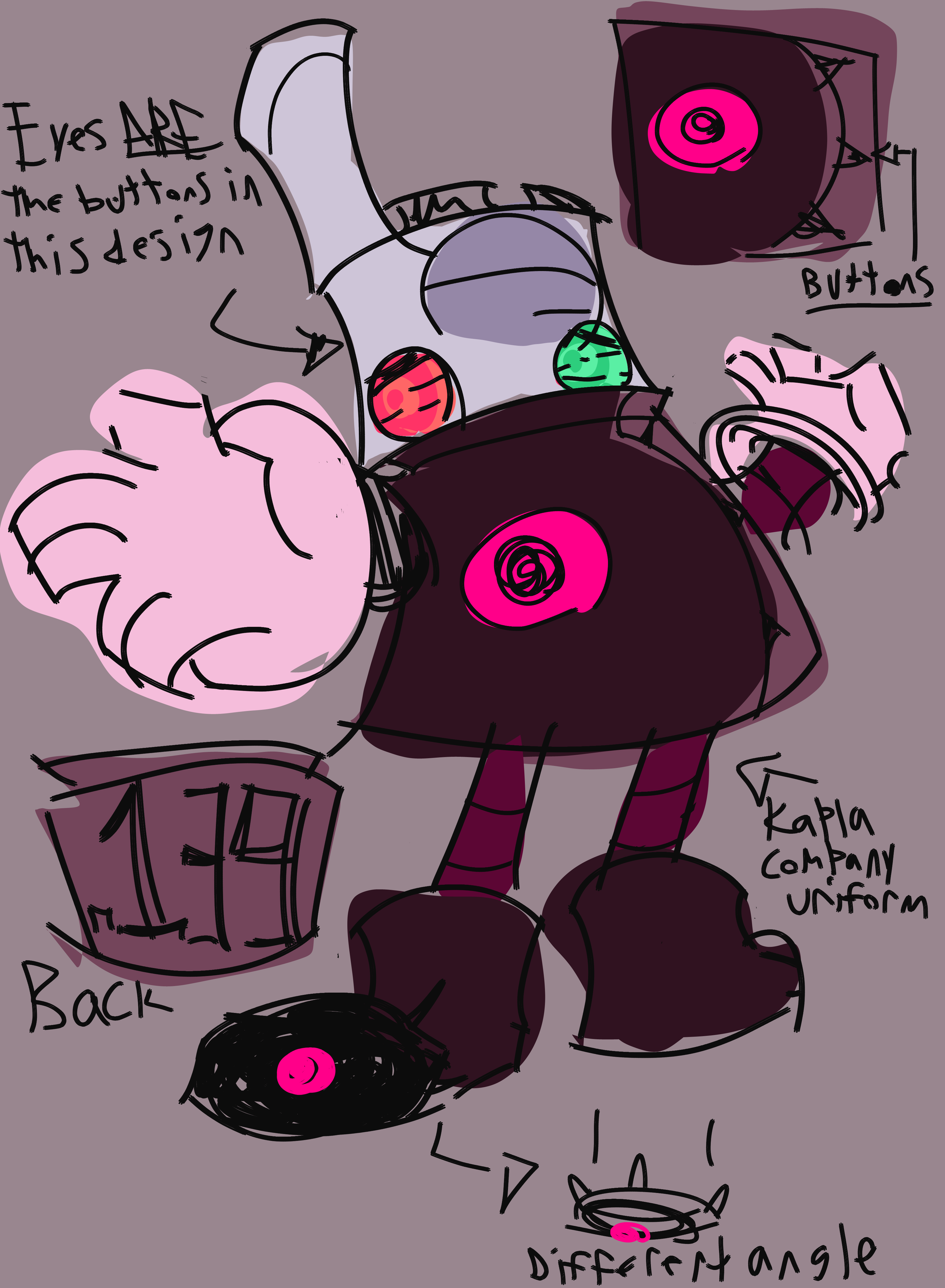 Commentary Commentary: I usually save designing the hosts for last, but I had such a good idea for a Walkie Talkie gijinka that I HAD to draw it down. There's not as much process here as the last design. It was pretty straightforward. -Just like with Notebook above, I had to make the buttons the eyes in order to not obstruct an important detail. -Him being a employee at Kapla Company was a great opportunity to design a uniform. I don't like drawing plain lab coats for these gijinkas, so I usually take some creative liberties. I wanted to give off the vibe like he was a mook of a bigger force. A suit that's so alien, yet intimidating. Yes, it is partially inspired by Invader Zim. These designs write themselves.
|
|
treasuredguardian
Contestant
   Gaming in the Dark Pit of Despair
Posts: 259
Pronouns: He/It/Void/Null/Pix/Vex/Byte/Blast/.EXE (see Bio for more neos)
Mini-Profile Background: {"image":"https://file.garden/ZWd7PdszsWLb2cuQ/Scenes%20to%20Redraw/PPT2%20Scenes/PPT2%20Episode%20Scenes/PPT2%2013%20Living%20on%20the%20Edge/vlcsnap-2023-10-17-12h17m53s995.png","color":""}
Mini-Profile Name Color: ffffff
Mini-Profile Text Color: ffffff
|
Post by treasuredguardian on Aug 21, 2024 21:59:41 GMT
Savior of the Restless World(PPT2)Commentary: Honestly, this plot is such a walking spoiler I question if it's even worth hiding an image over. But you never know when someone who hasn't watched this show DOESN'T want to be spoiled. Oh, it's a reference to something else that's also a spoiler, but I can't say what because that would spoil it as well. Whoops. I was going to add more details, but the events of the latest episode threw a wrench into those plans. I don't have a concrete merge iteration for Journal seeing as it's uncertain as to what has been going on behind the scenes. But chances are we aren't going to know for another few episodes, so I just went with a concept I had after LoTE's release and called it a day. I was originally going to draw it with my usual style but more rendered, but I really wanted to commit to the bit, so I opted for a different approach instead.
|
|
treasuredguardian
Contestant
   Gaming in the Dark Pit of Despair
Posts: 259
Pronouns: He/It/Void/Null/Pix/Vex/Byte/Blast/.EXE (see Bio for more neos)
Mini-Profile Background: {"image":"https://file.garden/ZWd7PdszsWLb2cuQ/Scenes%20to%20Redraw/PPT2%20Scenes/PPT2%20Episode%20Scenes/PPT2%2013%20Living%20on%20the%20Edge/vlcsnap-2023-10-17-12h17m53s995.png","color":""}
Mini-Profile Name Color: ffffff
Mini-Profile Text Color: ffffff
|
Post by treasuredguardian on Aug 26, 2024 5:17:18 GMT
PPT2 Characters but they look... Different? 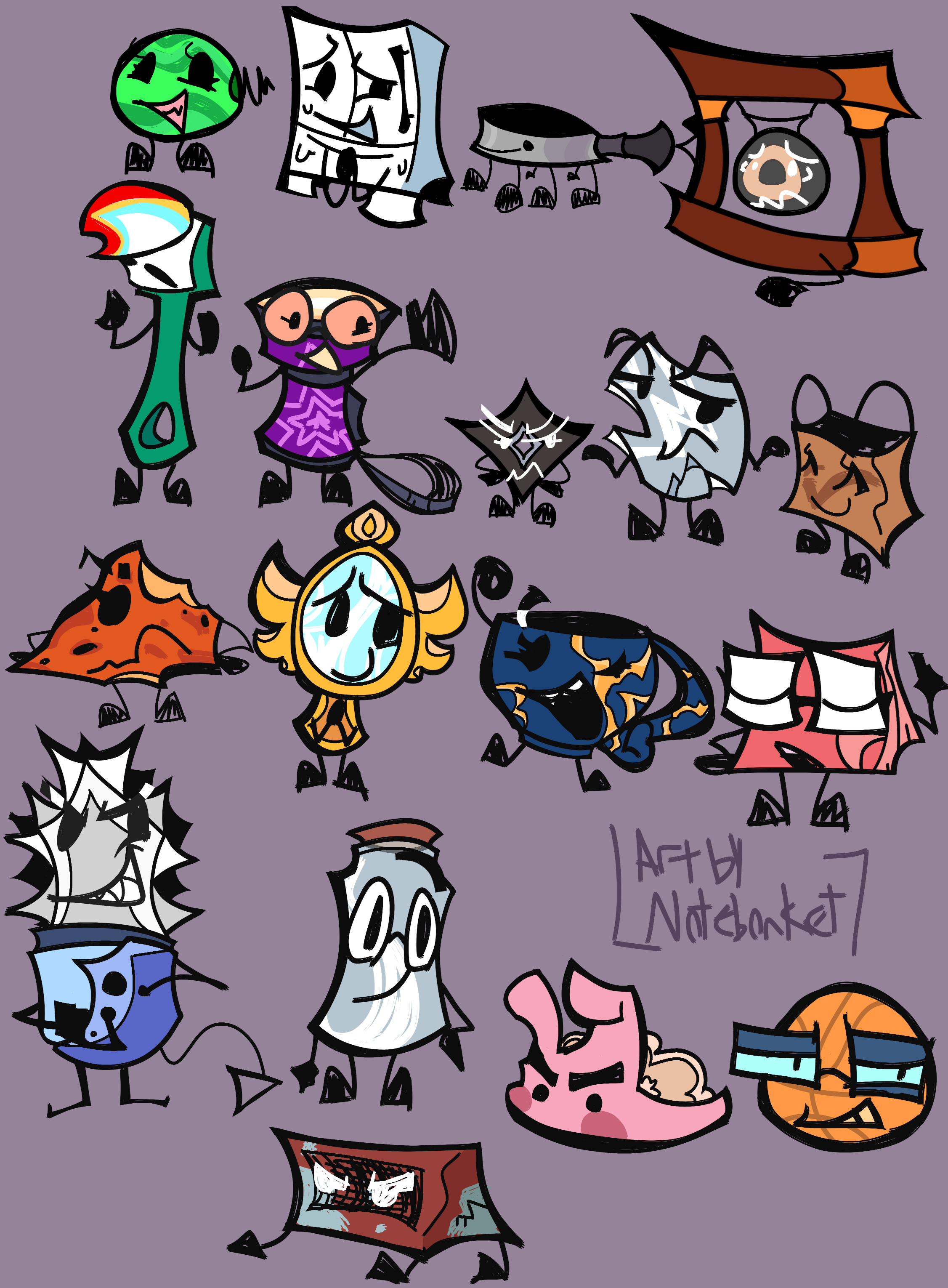 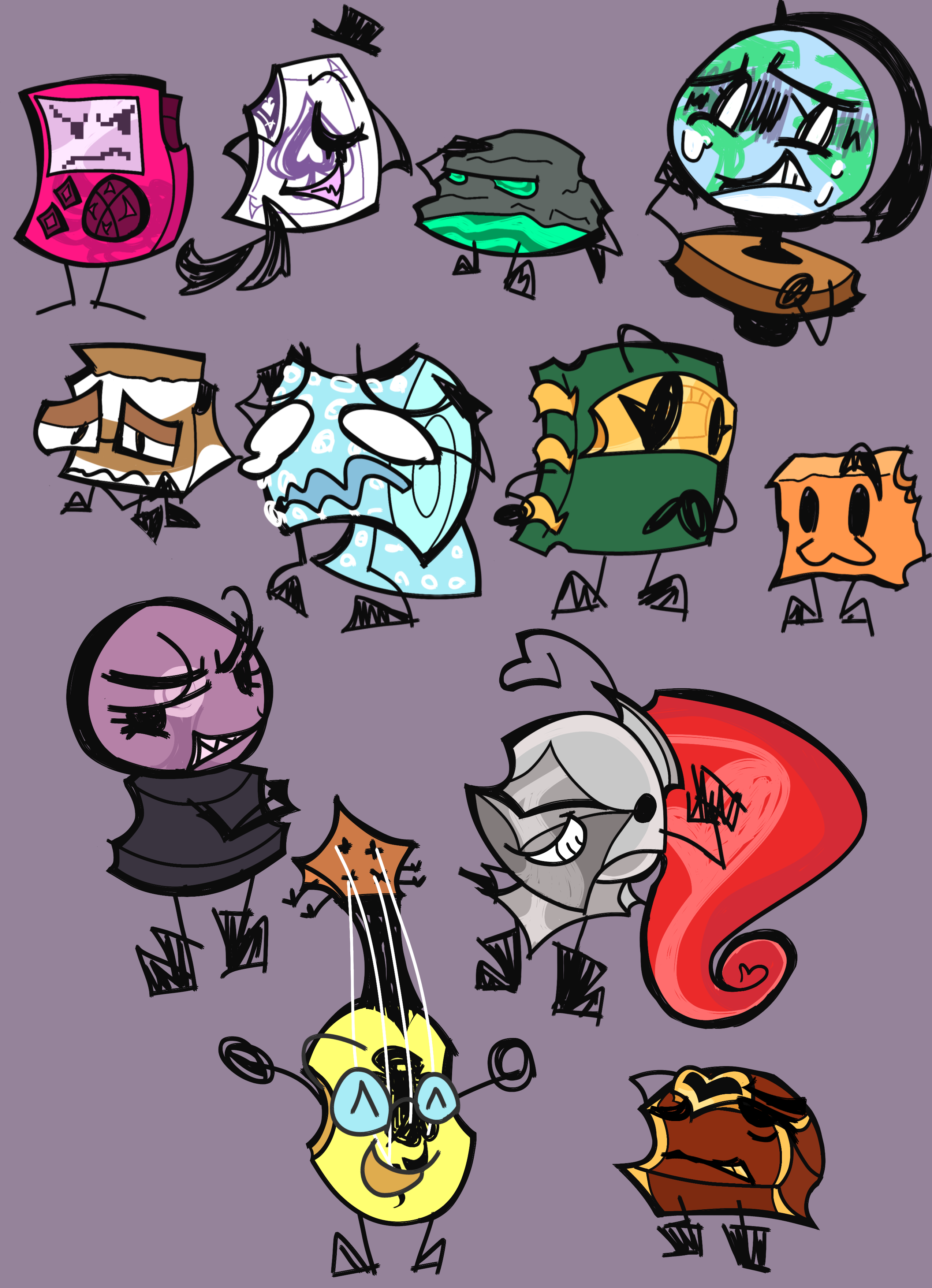 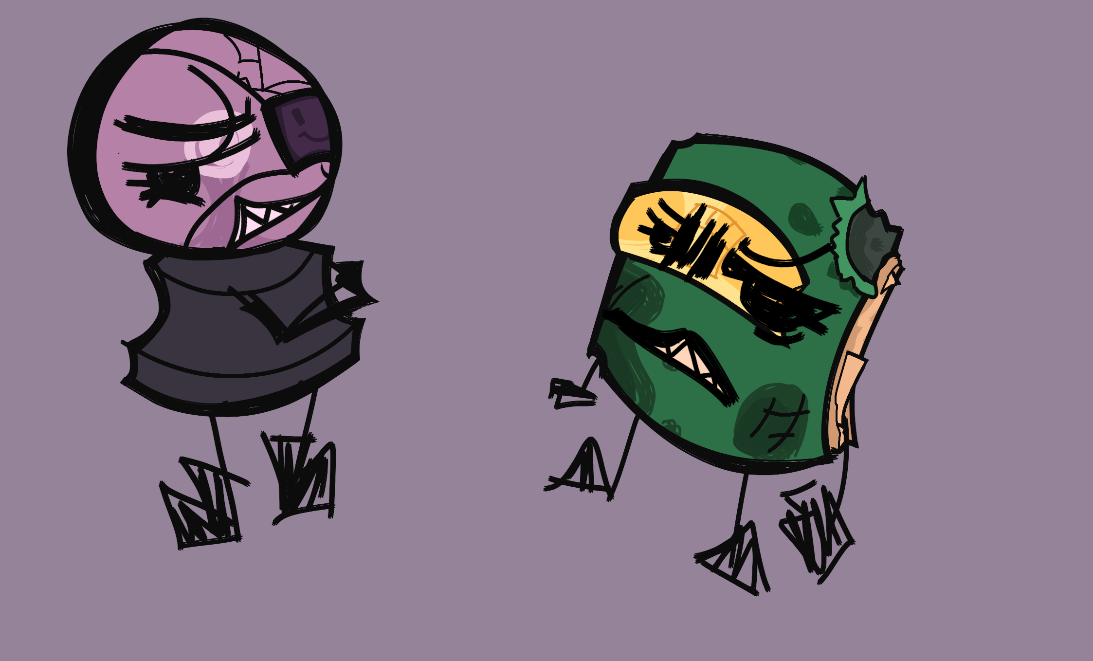 Commentary Commentary: You know how you see those drawings of BFDI contestants but rendered in a more modern or different art style? Well, as an avid redesigner, I decided to take a crack at alternate designs for the characters. Why do people get so worked up over redesigns anyway? It's something I never really understood. I get if it was really offensive or something, but most of the time they are just pretty harmless. There's nothing wrong with a redesign, drastic or otherwise. Even if an artist considers them a "fix", it really isn't worth harassing someone over. I don't redesign characters to "improve" them, but to show my appreciation for the work. Also because I am literally incapable of drawing the canon designs. If anything, these are nowhere near as drastic as my non-OSC ones. Oh yeah, the drawing. Excuse the signatures, this is over a year old. If there's one design I would tweak, it would be Treasure Chest's. Unfortunately, I lost the editing files for all of these. At least I have these files. Anyway, here's some fun facts! - Ace's design is based on those "see-through" magic cards you see in stores. I miss Ace's bunny ear design from episode 3 and felt this was the best way to implement it.
- Cup's design is based on the art of kintsugi, where you fill in the cracks of ceramic with Lacquer or gold. Cup is canonically a ceramic mug, which "A Rotten Egg" confirms through a remark from Basketball.
- Mr. Hand's design here doesn't really change in season 2. He just gets more abstract I guess???
- As Journal's character was based on Gravity Falls, I wanted to implement Journals 1 and 3 into his designs.
- Treasure Chest's design is based on his original asset, which was actually done by his recommender, AnimationFever(dA is no longer available and the user seems to have left entirely).
- I wanted to make Shuriken the smallest contestant in contrast to Gong being one of the biggest.
- DID YOU KNOW that Gong was recommended by the same person responsible for Bone's existence in Objects At War? If you thought Gong's reputation in Take 2 was bad, imagine how much worse it was in season 1. Gong got 4th for a reason. At least Caramel Cube was spared from the drama....
- ANOTHER FUN FACT: Minus rejected debuters, the show doesn't have any limbless contestants. It also lacks legless(characters with arms but no legs) characters in general.
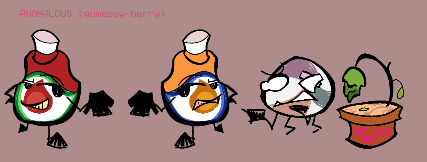
Through the Woods but they ALSO look different? 

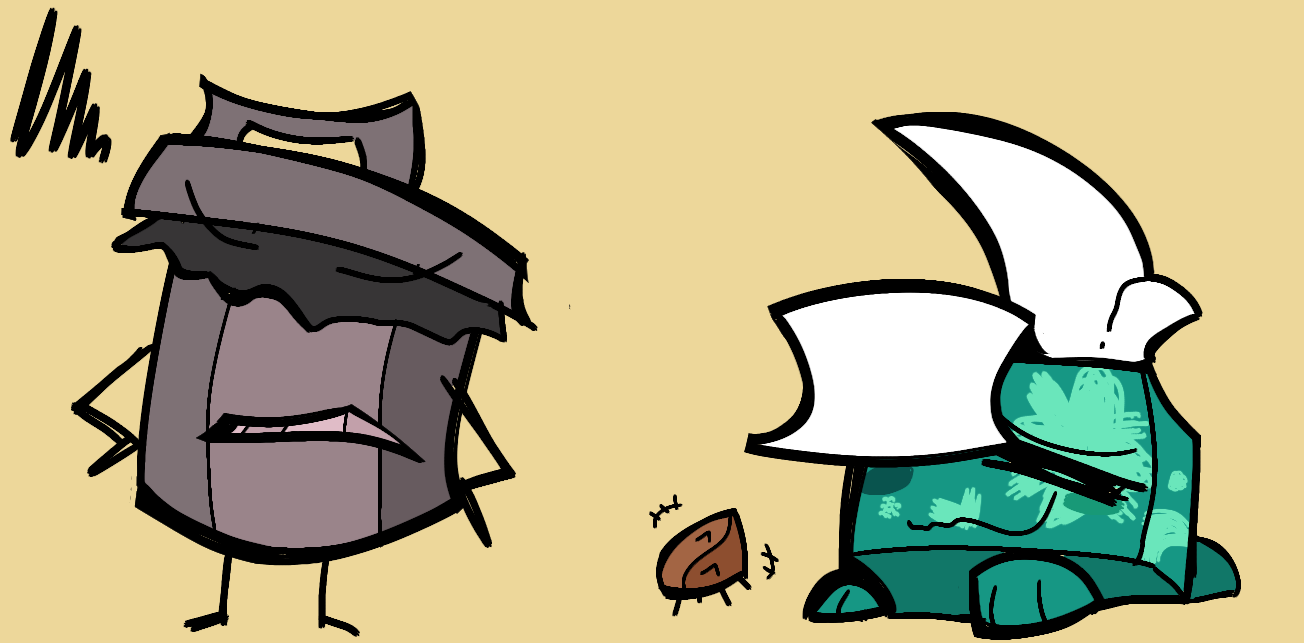
Commentary: I watched "Through the Woods" last year. Very charming. I thought the designs would be fun to redesign, so I did just that. I don't really have many fun facts about this in mind. I will say, non-objects tend to throw me for a loop, whether I'm redesigning them or making a gijinka. It's a case by case basis on WHAT to do with them. I felt it would be fitting if Mr. Lion was a sock puppet rather than an actual one. It would keep the same effect, I'm sure. Also, I made Swimmy a wilting sapling ala that one Peanuts Movie. I felt it would be funnier that way. This was also made last year.
|
|
natus
Debuter
  mlp squee
Posts: 155
Pronouns: he/xe/it
Mini-Profile Background: {"image":"https://i.ibb.co/qgXz905/muuuh.png","color":"#2B244D"}
Mini-Profile Name Color: 44EE8C
Mini-Profile Text Color: 660C0E
|
Post by natus on Aug 26, 2024 21:00:43 GMT
PPT2 Characters but they look... Different?    Commentary Commentary: You know how you see those drawings of BFDI contestants but rendered in a more modern or different art style? Well, as an avid redesigner, I decided to take a crack at alternate designs for the characters. Why do people get so worked up over redesigns anyway? It's something I never really understood. I get if it was really offensive or something, but most of the time they are just pretty harmless. There's nothing wrong with a redesign, drastic or otherwise. Even if an artist considers them a "fix", it really isn't worth harassing someone over. I don't redesign characters to "improve" them, but to show my appreciation for the work. Also because I am literally incapable of drawing the canon designs. If anything, these are nowhere near as drastic as my non-OSC ones. Oh yeah, the drawing. Excuse the signatures, this is over a year old. If there's one design I would tweak, it would be Treasure Chest's. Unfortunately, I lost the editing files for all of these. At least I have these files. Anyway, here's some fun facts! - Ace's design is based on those "see-through" magic cards you see in stores. I miss Ace's bunny ear design from episode 3 and felt this was the best way to implement it.
- Cup's design is based on the art of kintsugi, where you fill in the cracks of ceramic with Lacquer or gold. Cup is canonically a ceramic mug, which "A Rotten Egg" confirms through a remark from Basketball.
- Mr. Hand's design here doesn't really change in season 2. He just gets more abstract I guess???
- As Journal's character was based on Gravity Falls, I wanted to implement Journals 1 and 3 into his designs.
- Treasure Chest's design is based on his original asset, which was actually done by his recommender, AnimationFever(dA is no longer available and the user seems to have left entirely).
- I wanted to make Shuriken the smallest contestant in contrast to Gong being one of the biggest.
- DID YOU KNOW that Gong was recommended by the same person responsible for Bone's existence in Objects At War? If you thought Gong's reputation in Take 2 was bad, imagine how much worse it was in season 1. Gong got 4th for a reason. At least Caramel Cube was spared from the drama....
- ANOTHER FUN FACT: Minus rejected debuters, the show doesn't have any limbless contestants. It also lacks legless(characters with arms but no legs) characters in general.
Through the Woods but they ALSO look different? 


Commentary: I watched "Through the Woods" last year. Very charming. I thought the designs would be fun to redesign, so I did just that. I don't really have many fun facts about this in mind. I will say, non-objects tend to throw me for a loop, whether I'm redesigning them or making a gijinka. It's a case by case basis on WHAT to do with them. I felt it would be fitting if Mr. Lion was a sock puppet rather than an actual one. It would keep the same effect, I'm sure. Also, I made Swimmy a wilting sapling ala that one Peanuts Movie. I felt it would be funnier that way. This was also made last year.
WOW WOWWW very interesting designs!!! |
|
objectirl
Debuter
  Thinking about objects 24/7.
Posts: 184
Pronouns: they/it (collective only)
|
Post by objectirl on Aug 27, 2024 6:38:51 GMT
PPT2 Characters but they look... Different?    Commentary Commentary: You know how you see those drawings of BFDI contestants but rendered in a more modern or different art style? Well, as an avid redesigner, I decided to take a crack at alternate designs for the characters. Why do people get so worked up over redesigns anyway? It's something I never really understood. I get if it was really offensive or something, but most of the time they are just pretty harmless. There's nothing wrong with a redesign, drastic or otherwise. Even if an artist considers them a "fix", it really isn't worth harassing someone over. I don't redesign characters to "improve" them, but to show my appreciation for the work. Also because I am literally incapable of drawing the canon designs. If anything, these are nowhere near as drastic as my non-OSC ones. Oh yeah, the drawing. Excuse the signatures, this is over a year old. If there's one design I would tweak, it would be Treasure Chest's. Unfortunately, I lost the editing files for all of these. At least I have these files. Anyway, here's some fun facts! - Ace's design is based on those "see-through" magic cards you see in stores. I miss Ace's bunny ear design from episode 3 and felt this was the best way to implement it.
- Cup's design is based on the art of kintsugi, where you fill in the cracks of ceramic with Lacquer or gold. Cup is canonically a ceramic mug, which "A Rotten Egg" confirms through a remark from Basketball.
- Mr. Hand's design here doesn't really change in season 2. He just gets more abstract I guess???
- As Journal's character was based on Gravity Falls, I wanted to implement Journals 1 and 3 into his designs.
- Treasure Chest's design is based on his original asset, which was actually done by his recommender, AnimationFever(dA is no longer available and the user seems to have left entirely).
- I wanted to make Shuriken the smallest contestant in contrast to Gong being one of the biggest.
- DID YOU KNOW that Gong was recommended by the same person responsible for Bone's existence in Objects At War? If you thought Gong's reputation in Take 2 was bad, imagine how much worse it was in season 1. Gong got 4th for a reason. At least Caramel Cube was spared from the drama....
- ANOTHER FUN FACT: Minus rejected debuters, the show doesn't have any limbless contestants. It also lacks legless(characters with arms but no legs) characters in general.
Through the Woods but they ALSO look different? 


Commentary: I watched "Through the Woods" last year. Very charming. I thought the designs would be fun to redesign, so I did just that. I don't really have many fun facts about this in mind. I will say, non-objects tend to throw me for a loop, whether I'm redesigning them or making a gijinka. It's a case by case basis on WHAT to do with them. I felt it would be fitting if Mr. Lion was a sock puppet rather than an actual one. It would keep the same effect, I'm sure. Also, I made Swimmy a wilting sapling ala that one Peanuts Movie. I felt it would be funnier that way. This was also made last year.
rrly neat... wuw the Knight Helmet design |
|
treasuredguardian
Contestant
   Gaming in the Dark Pit of Despair
Posts: 259
Pronouns: He/It/Void/Null/Pix/Vex/Byte/Blast/.EXE (see Bio for more neos)
Mini-Profile Background: {"image":"https://file.garden/ZWd7PdszsWLb2cuQ/Scenes%20to%20Redraw/PPT2%20Scenes/PPT2%20Episode%20Scenes/PPT2%2013%20Living%20on%20the%20Edge/vlcsnap-2023-10-17-12h17m53s995.png","color":""}
Mini-Profile Name Color: ffffff
Mini-Profile Text Color: ffffff
|
Post by treasuredguardian on Aug 27, 2024 7:03:15 GMT
Thx you two! Redesigning is always fun. :]
|
|
treasuredguardian
Contestant
   Gaming in the Dark Pit of Despair
Posts: 259
Pronouns: He/It/Void/Null/Pix/Vex/Byte/Blast/.EXE (see Bio for more neos)
Mini-Profile Background: {"image":"https://file.garden/ZWd7PdszsWLb2cuQ/Scenes%20to%20Redraw/PPT2%20Scenes/PPT2%20Episode%20Scenes/PPT2%2013%20Living%20on%20the%20Edge/vlcsnap-2023-10-17-12h17m53s995.png","color":""}
Mini-Profile Name Color: ffffff
Mini-Profile Text Color: ffffff
|
Post by treasuredguardian on Aug 28, 2024 0:29:37 GMT
Book gijinka CONCEPT ART(BFDI)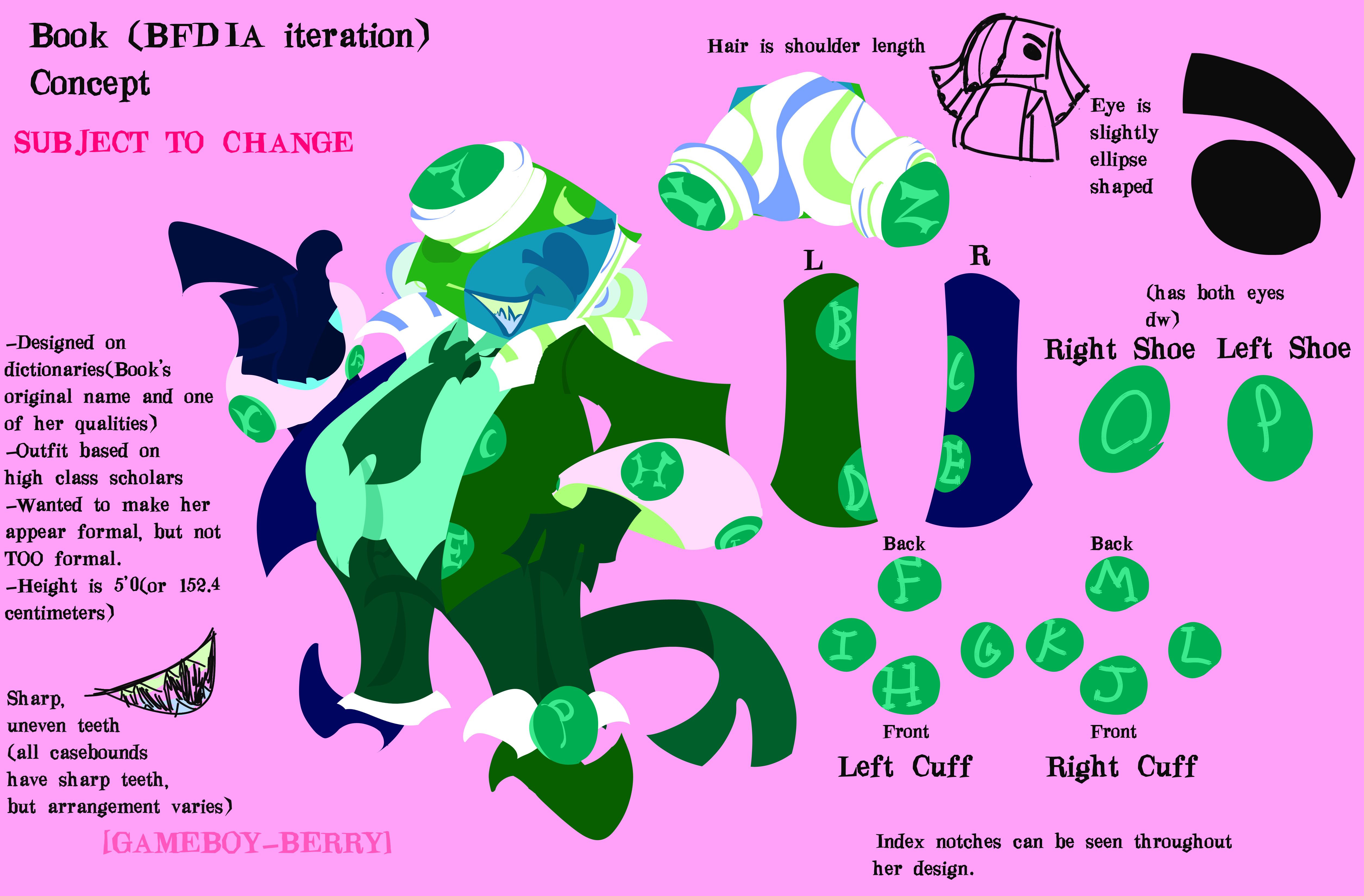 Commentary Commentary: I write my design processes for these designs in a document. So apologies if it goes over things I mentioned in earlier posts. Also some miscellaneous facts: - The first draft for this design was drawn in spring of last year I think? That was when I did my BFDI rewatch at the time. It's not too different, I just streamlined the design and touched up a few details for clarity.
- The story behind my "casebound books all have sharp teeth(and only some spiral bounds do)" headcanon goes waaaaay back to at least 6-7 years ago. All you need to know is that it came from a single frame from a show that most people probably don't know or care about. I feel the reason why casebounds would all have them comes down to what they are made of. Whereas for the spiralbounds, it's more akin to a mutation. The teeth is made of cardstock, so it's not like they can puncture most objects with those chompers. At most give a bad papercut, which is considerably a worse fate.
- Parts of the design were inspired by an OSC gijinka artist I looked up to for my designs. Unfortunately, the artist left Twitter and I don't know what exactly became of them. A shame, but I understand the decision. :[ (They are actually responsible for a rather popular headcanon for Book's character, so do with that as you will.)
- I don't have an idea in mind for later seasons... Nor do I have one for that time Flower gave her a makeover. This design alone already took a while to get down... Even then I wouldn't consider it final just yet.
- I couldn't really fit letters Q-X into her design. And I forgot the letter N. >_<
- The height listed is based on the assumption that Pencil would be 5'7".
|
|
|
|
treasuredguardian
Contestant
   Gaming in the Dark Pit of Despair
Posts: 259
Pronouns: He/It/Void/Null/Pix/Vex/Byte/Blast/.EXE (see Bio for more neos)
Mini-Profile Background: {"image":"https://file.garden/ZWd7PdszsWLb2cuQ/Scenes%20to%20Redraw/PPT2%20Scenes/PPT2%20Episode%20Scenes/PPT2%2013%20Living%20on%20the%20Edge/vlcsnap-2023-10-17-12h17m53s995.png","color":""}
Mini-Profile Name Color: ffffff
Mini-Profile Text Color: ffffff
|
Post by treasuredguardian on Sept 18, 2024 21:44:07 GMT
The Faceless(OC)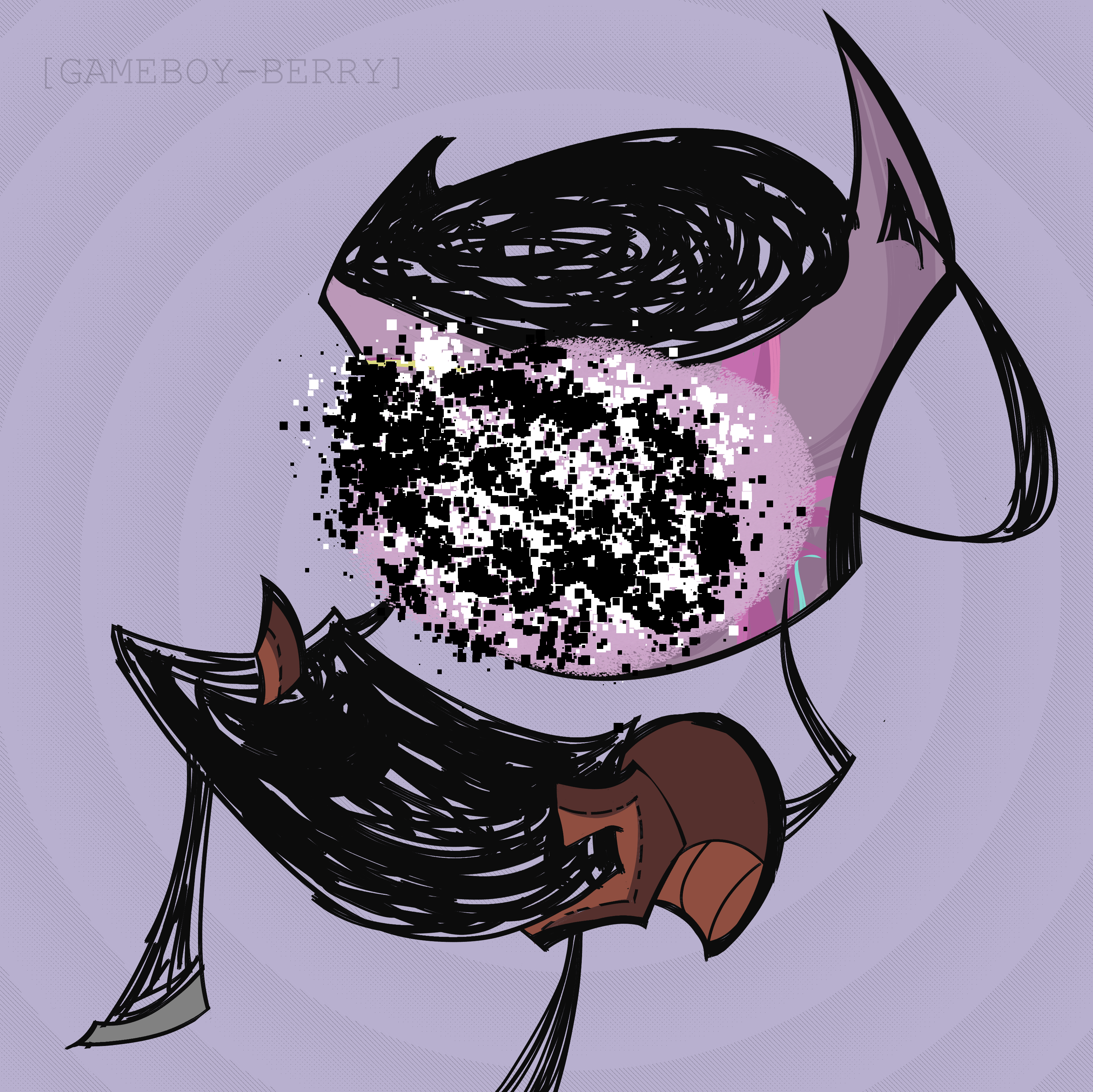 Commentary Commentary: For a while I've been working on this project involving 6 characters and a wild goose chase. This is one of those 6 characters. I would share more of it, but it's not really set in stone. The project as a whole is mostly for fun, and I don't really intend on releasing it anytime soon. I can't really get into the specifics as to why Vierian here wears a mask. All I can say is that it's for symbolic and practical reasons. Also yeah, it is based on those chalkboard squares you see on some tin buckets.
|
|
treasuredguardian
Contestant
   Gaming in the Dark Pit of Despair
Posts: 259
Pronouns: He/It/Void/Null/Pix/Vex/Byte/Blast/.EXE (see Bio for more neos)
Mini-Profile Background: {"image":"https://file.garden/ZWd7PdszsWLb2cuQ/Scenes%20to%20Redraw/PPT2%20Scenes/PPT2%20Episode%20Scenes/PPT2%2013%20Living%20on%20the%20Edge/vlcsnap-2023-10-17-12h17m53s995.png","color":""}
Mini-Profile Name Color: ffffff
Mini-Profile Text Color: ffffff
|
Post by treasuredguardian on Sept 21, 2024 0:00:00 GMT
Now We're Only Falling Apart(PPT2)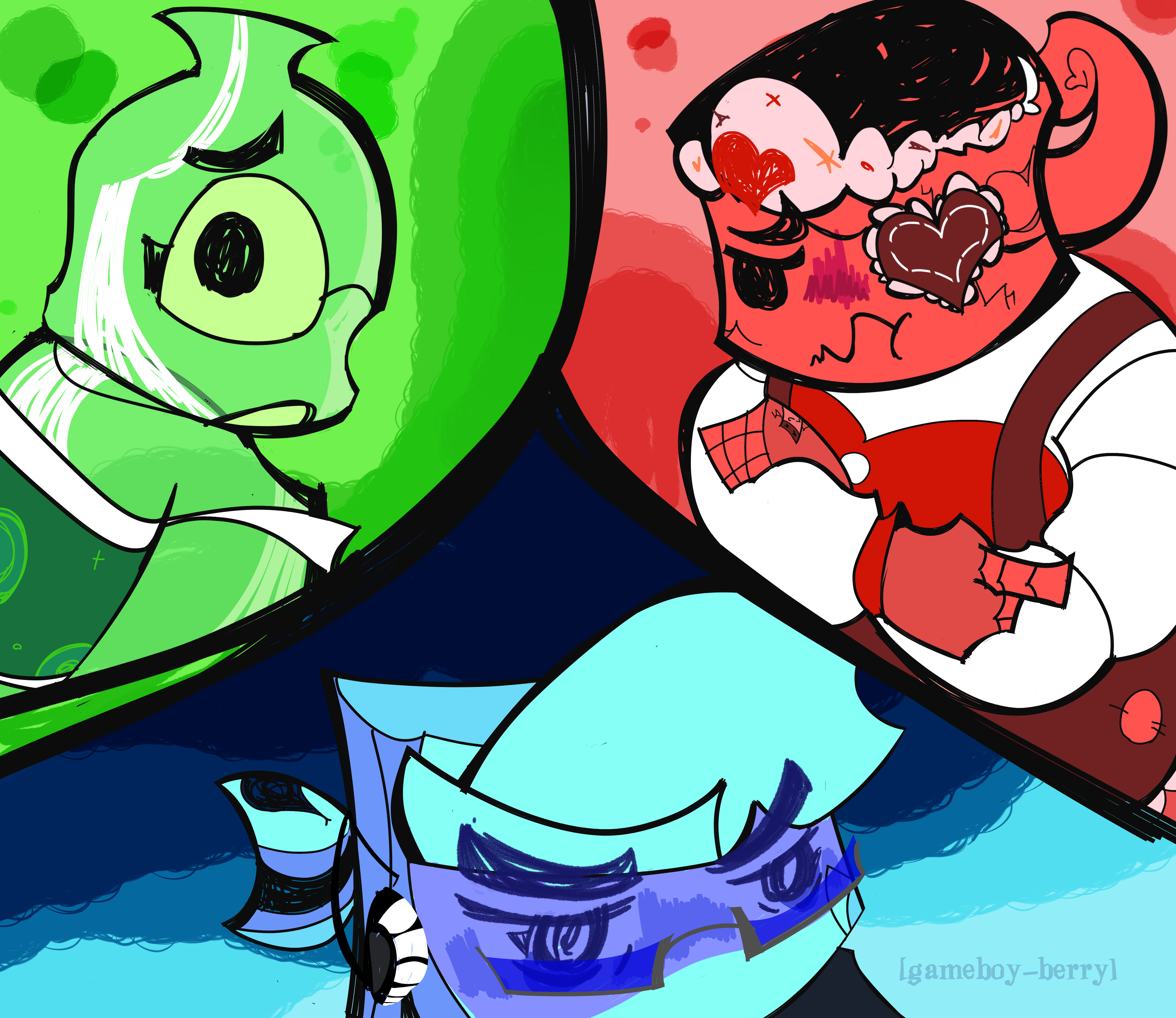 Commentary Commentary(Contains Spoilers for episodes 13 and 14 of PPT2!!):
A redraw of something I made before "Platinum Puppets" came out. Given the ending of "Living on the Edge" and the teasers for "Platinum Puppets", I deduced that Bottle and Post-It Note would have a falling out. Not only was I right, but my prediction of Post-It Note getting eliminated early in the merge was correct. In hindsight... It was pretty obvious. Still feels bad man. OH and it's also loosely based on a scene from Inanimate Insanity 2, so there's that.
|
|
treasuredguardian
Contestant
   Gaming in the Dark Pit of Despair
Posts: 259
Pronouns: He/It/Void/Null/Pix/Vex/Byte/Blast/.EXE (see Bio for more neos)
Mini-Profile Background: {"image":"https://file.garden/ZWd7PdszsWLb2cuQ/Scenes%20to%20Redraw/PPT2%20Scenes/PPT2%20Episode%20Scenes/PPT2%2013%20Living%20on%20the%20Edge/vlcsnap-2023-10-17-12h17m53s995.png","color":""}
Mini-Profile Name Color: ffffff
Mini-Profile Text Color: ffffff
|
Post by treasuredguardian on Oct 12, 2024 7:14:26 GMT
Happy Halloween from Paper Puppets!! Commentary Commentary: It's not Halloween, but better early than never. There's more characters I wanted to do, but I felt they didn't really fit the PPT2 characters all too well. Here's what all of the characters reference, and why: Gold Ingot- CEO from Toontown OnlineJournal- The Author/Stanford Pines from Gravity Falls Shuriken- Shuriken from PHIGHTING!Malachite- Brick from Total DramaGold Ingot: The Bossbots partake in golfing, which is used as a form of networking for Real Life Business Associates. The CEO has this exclusive move called "FORE!". Gold Ingot is a host who partakes in golfing as a hobby. Yeah. Journal- Journal is based on Gravity Falls, and his writing is a composite of both Dipper and the Author. I chose the latter because his outfit fit better with my gijinka design. Shuriken- Do I even need to explain this one? Malachite- Malchite is an expy of Brick from Total Drama. If you have ever wondered why he's into the military, that's why.
|
|
treasuredguardian
Contestant
   Gaming in the Dark Pit of Despair
Posts: 259
Pronouns: He/It/Void/Null/Pix/Vex/Byte/Blast/.EXE (see Bio for more neos)
Mini-Profile Background: {"image":"https://file.garden/ZWd7PdszsWLb2cuQ/Scenes%20to%20Redraw/PPT2%20Scenes/PPT2%20Episode%20Scenes/PPT2%2013%20Living%20on%20the%20Edge/vlcsnap-2023-10-17-12h17m53s995.png","color":""}
Mini-Profile Name Color: ffffff
Mini-Profile Text Color: ffffff
|
Post by treasuredguardian on Oct 23, 2024 18:23:51 GMT
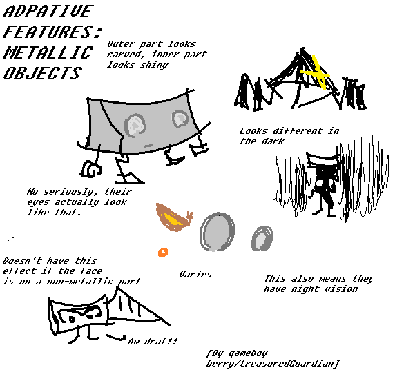
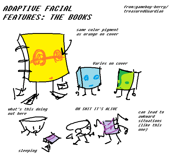
The Main 6 characters for that project I've been working on(concept art) Commentary: Remember a few posts back when I brought up that I was working on something that involved 6 characters? Well... Here are those characters. Again, details on their characteristics and story aren't quite set in stone. And the more concrete details are major story spoilers. I will go over some of the process behind their designs. The warm colored characters are based on more uncommon objects used in object shows(lyres, spinning tops, and tin snips) while the cool colored ones are based on the really common ones(jewelry, books, and containers). The latter group have a few twists that make them stand out a bit more; Blyss is a mood ring, Ingema is a children's pop-up book, and 'Vierian' is partially made from a fictional alloy I made up. Hence the reflective colors.
These designs aren't final, I just wanted to draw out the foundation for future iterations. I just... Got carried away with the lineart. It happens. I think it's pretty obvious, but their heights are based on how tall their real world counterparts would be. Which means their height go as follows: Renato > Ingema > 'Vierian' (with and without platforms) > Oradre > Yestras > Blyss Obviously, they are not the exact sizes. But compared to other object shows, I'd say it's more accurate to their objects here.
Other notes:
Oh and here's how to pronounce their names:
Renato: wreh-nah-tow Oradre: or-uh-durr Yestras: yeh-say-truss Blyss: bliss Ingema: en-guh-mah Vierian: vari-en
|
|


.png)


.png)




.png)
.png)






.png)